
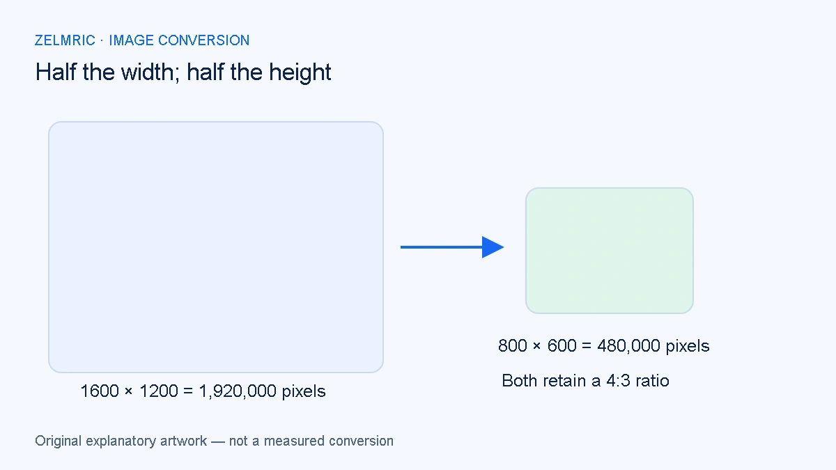
A 1600 × 1200 image has a 4:3 aspect ratio. Reducing it to 800 × 600 keeps that relationship. Forcing it into 800 × 800 does not: either the content must be cropped, given surrounding space or stretched. These operations can produce very different pictures even though two of the results share the same width.
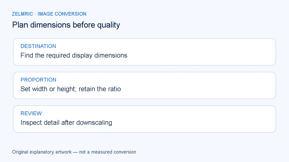
Start a resize decision with the destination’s shape and required dimensions. File size comes later. This guide walks through the geometry, the controls available in Zelmric and the checks that prevent a smaller delivery image from becoming a distorted or unreadable one.
Describe the destination in useful units
Ask where the image will appear: an article column, a product card, a full-width banner or an upload field with stated requirements. Separate a layout’s displayed width from the pixel dimensions of the file. A browser can show an image smaller than its native size without changing the file you downloaded.
Screen density and responsive layouts can affect how much source resolution a website needs. There is no single correct width for all sites or devices. Follow the destination’s specifications where available, and test the actual placement rather than assuming that any fixed pixel target guarantees sharpness.
Calculate the missing dimension
For proportional resizing, multiply both dimensions by the same scale. Starting from 1600 × 1200, choosing a width of 800 gives a scale of 800 divided by 1600, or one half. Multiplying the height by that scale gives 600. The result is 800 × 600.
Alternatively, choosing a height of 300 gives a scale of one quarter and a width of 400. These examples are arithmetic, not measured file-size tests. When a calculation does not produce whole pixels, an image tool must round to integer dimensions; inspect the reported output size instead of expecting fractional pixels in the download.
Use the converter’s controls for their actual purpose
The WebP Converter offers Keep original dimensions, Set width and Set height. Width and height modes retain the original proportions and scale down only. A target larger than the source dimension does not enlarge the image. Original dimensions means the decoded size, not a promise to preserve every piece of source metadata.
This tool does not provide an independent width-and-height stretch mode, crop selection or padding controls. If a destination demands a different aspect ratio, prepare the crop or composition in an editor first. Do not describe the width setting as a way to turn a landscape photograph into a square without changing its content.
Pixel count is not a file-size forecast
The original 1600 × 1200 example contains 1,920,000 pixels. The 800 × 600 version contains 480,000, one quarter as many. That relationship follows directly from reducing both dimensions by half. It does not establish that the compressed output will occupy exactly one quarter of the bytes.
Encoding also depends on image content, quality request and file structure. A flat diagram and a detailed photograph with equal dimensions can behave differently. Use the actual original and WebP sizes after conversion. If an output grows unexpectedly, the larger-file diagnostic separates those causes from the dimension calculation.
Decide whether the remaining detail is enough
Downscaling removes spatial information. Thin lettering, closely spaced lines and small features may become difficult to distinguish even at a high encoding-quality request. Inspect the image at its intended display size and verify that the viewer can still identify the information the asset is supposed to communicate.
For a fair test, keep the source and quality request steady while comparing dimensions. Then hold the selected dimensions steady while assessing quality. The quality checklist focuses on that second decision. Increasing encoding quality cannot recreate a feature that is no longer represented adequately by the reduced pixel grid.
Keep transparency and vectors in view
A transparent logo can change appearance when its edges are represented by fewer pixels. Check it on the background where it will be used, not only on a white preview. A missing narrow gap or a softened outline may be a scale problem rather than a loss of the entire alpha channel.
SVG sources add another distinction: a vector drawing must first become a pixel image for WebP output. The SVG’s decoded dimensions affect that starting raster. Read the SVG rasterisation guide when the file looks unexpectedly small or blurry. The converter’s downscale controls are not a replacement for choosing a suitable vector export size.
Apply a dimension policy without forcing every asset into it
For a collection, record the source size, required destination size and whether cropping is needed. Group assets that can share a maximum width or height. A banner, a square product card and a narrow icon do not become interchangeable simply because they are in the same folder.
The batch review workflow keeps those exceptions visible. Zelmric caps input dimensions and decoded pixel count, so requesting a small output is not a promise that an oversized source will be accepted. Prepare a manageable source first when the input exceeds the limits.
Record a decision that survives the next layout change
Save the accepted delivery image with its dimensions and keep the source separately. Check the exported file in the real layout, including any responsive version that matters. If the page later needs a larger image or another crop, return to the source instead of enlarging the reduced WebP.
Before accepting a reduced image, read its smallest useful label and check its narrowest important gap in the actual layout. If either disappears, revisit the chosen dimensions before adjusting encoding quality. If the destination needs a different shape, prepare that crop in an editor; changing a proportional width cannot turn a banner into a square.
Apply your dimension plan
Choose width or height, retain the ratio and inspect the resulting pixel dimensions.
Set proportional dimensions